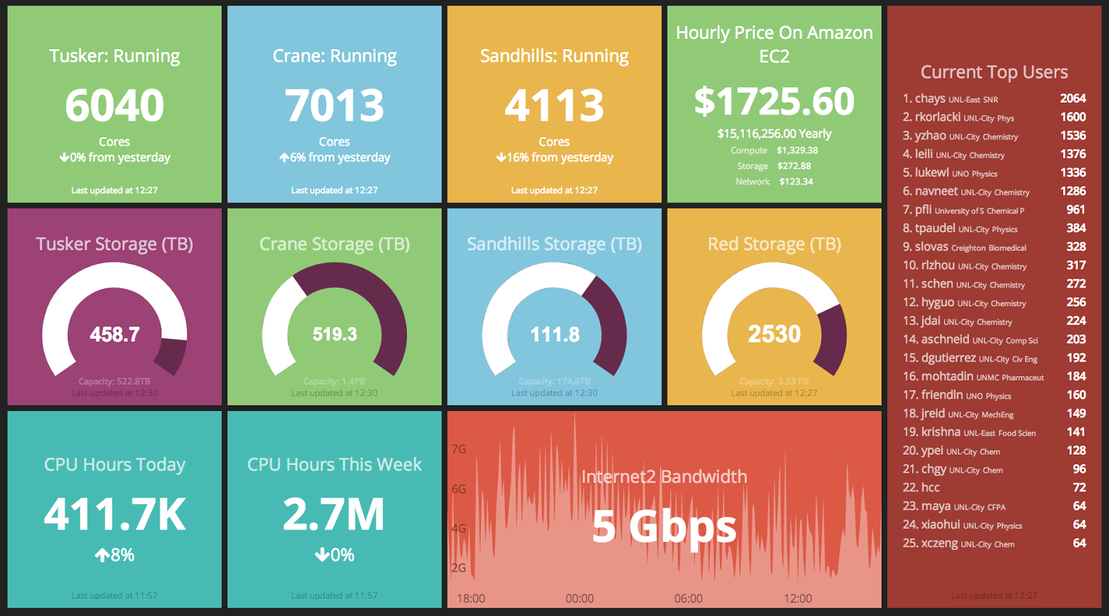
After the 2013 SuperComputing Conference, we found ourselves with a extra monitor at HCC. Therefore, I set about creating a dashboard which can show the current status of HCC.
Creating the Dashboard
I have an interest in data visualization, and follow many blogs that show off new methods. On one occasion, I saw
Dashing mentioned.
Dashing is a dashboard framework made by
Shopify for their own use, and released as open source. It is mostly written in
Ruby and
CoffeeScript (a higher level javascript, if you can imagine). It has a concept of jobs which fetch data and forward the data to the framework. The data is sent to clients viewing the dashboard, where it is parsed by the Coffeescript and modeled with a combination of data bindings from
batman.js, CSS with
SCSS, and plain old HTML.
I wrote several
jobs to retrieve data from numerous sources. Most of the information is from HCC's local instance of OSG's
Gratia accounting system. The HCC Dashboard uses our gratia system for:
- How many CPU hours where consumed on our resources.
- Current usage by User (http://hcc.unl.edu//gratia/)
The job to retrieve the top user's also communicates with HCC's user database to retrieve college and department information. The storage meters use an external probe on the clusters to periodically report the used storage space of our filesystems.
Each box is an instances of a
widget. A widget is a combination of HTML, SCSS, and CoffeeScript that are used to parse and present the data.
Current Dashboard Design
Most of the information on the dashboard is in the form of monitoring. The current number of cores used on our resources and the top users widgets use Gratia monitoring information. The networking graph uses Ganglia.
We also include a "Hourly Price on Amazon EC2" widget. This combines the computing, storage, and networking costs (extrapolated from current values), and displays an expected price per hour on Amazon. The computing is easily the most expensive component.
Who Uses it?
HCC uses it to display the current status of our computing center. It is useful to see if anything is working incorrectly. For example, we where able to spot problems on one of our clusters when the number of running cores decreased significantly, which was caused by the scheduler draining off a significant portion of the cluster in order for a single user to run a toy job.
The top users is also interesting for HCC researchers when the come into the offices. They are able to see their own usernames on the big display, prominently displayed.
 |
| Growing collection of visualizations |
More Information
The source for the dashboard is available on
Github. Also, the live instance of the dashboard is available
here.


Leave a comment