Over the winter break, I worked on improving the interface that most users use for OSG accounting. When I returned from break, I worked with Ashu to integrate the changes with some recent changes he had made. The new interface runs on gratiaweb-itb. The source for the new web page is hosted on github.
The first thing users will notice is the newly designed interface:
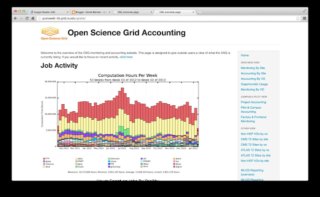 |
| New OSG Accounting Interface |
The updated interface brings the style of the website inline with that of MyOSG and OIM (or, close). The design stayed close the the original, but the menu on the right has changed significantly. First is just the style of the menu. But also we added a new category, Campus and Pilot View.
In the Campus and Pilot View, we have some new graphs that show usage by GlideinWMS, Campus users, XSEDE users, and in the future, Bosco users.
Lets run through a quick example. In this example, lets assume I'm a VO manager and want to see where my VO is running, how many hours, and who is running.
- Select the Pilot & Campus Accounting link.
- Scroll to the bottom, to the Refine View.
- Enter your VO name into the VO text box and hit enter.
This will pull up the custom page that shows usage for only your VO. For example, if I look at the osg VO:
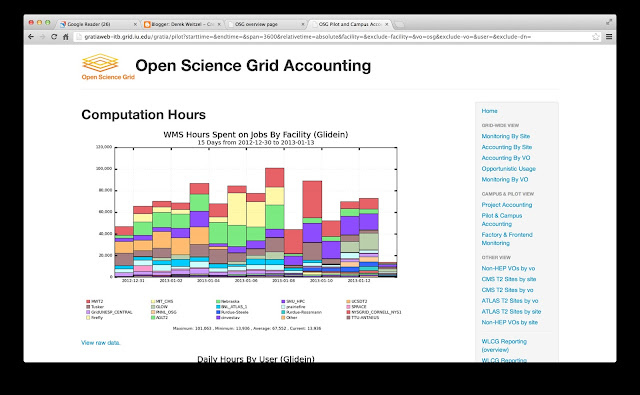 |
| Usage by the OSG VO. |
You can see from the graphs that the OSG VO has used ~80,000 CPU hours a day on the OSG. Also, they are running at over 20 sites. The sites at the bottom of the graph are listed in order of total hours (I am happy to see Nebraska resources as #3, #6, and #9).
You can also see from the graph that usage at sites depends on the day. Some days they get significant usage at the MWT2 (UChicago and IU), and some days they run a lot at Nebraska.
The new usage graphs are intended to help users, administrators, and VO managers view their usage. I hope you find them as useful as we have in the past.
We hope that webpage is an improvement. If there are any comments on further improvements, we are interested in your feedback.



Leave a comment